So, Your Landing Page is More of a "Meh" Page? Let's Fix That.
You've poured your heart, soul, and probably more coffee than is medically advisable into crafting what you *thought* was the perfect landing page. You slapped on some pretty images, wrote copy that would make Shakespeare weep (or perhaps just yawn), and hit publish. Then, crickets. Silence. The digital tumbleweeds are rolling through your analytics. If your landing page is currently about as effective as a screen door on a submarine, it's time for some brutal honesty and even more brutal optimization.
The High-Cost of a Low-Performing Landing Page
Let's cut to the chase. Your landing page isn't just a digital brochure; it's your frontline soldier on the battlefield of conversions. A poorly optimized landing page isn't just a missed opportunity; it's a
money pit. Every single click that lands on a page that doesn't convert is a wasted dollar, a squandered lead, and a missed chance to grow your business. Think about it: you're spending good money on PPC ads, social media campaigns, or email blasts to drive traffic. If that traffic lands on a page that makes visitors scratch their heads or, worse, hit the back button faster than a politician backtracking on a promise, you're essentially setting your marketing budget on fire. Sites built on template platforms like Wix, Squarespace, or even GoDaddy often fall into this trap. They're easy to set up, sure, but they rarely offer the granular control needed for true landing page optimization (LPO). They’re the digital equivalent of a fast-food burger: quick, somewhat satisfying, but ultimately lacking the bespoke flavor and nutritional value of a gourmet meal. We're here to serve you steak.
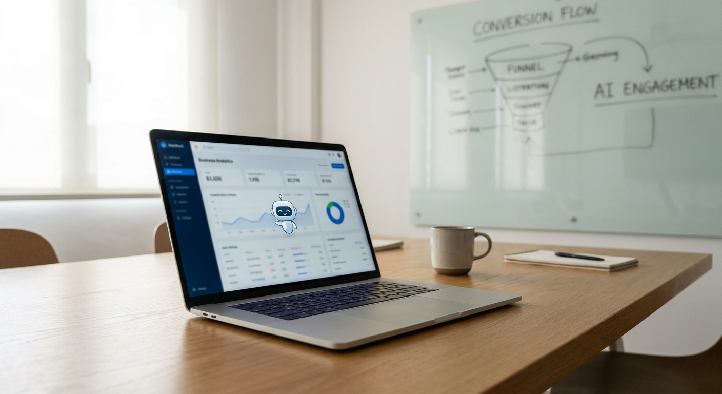
15 Landing Page Tweaks That Actually Work
Forget the fluffy fluff. We’re talking about actionable, impactful changes that will make your visitors stop, look, and *do* what you want them to do. This isn't about placebo buttons or vague "best practices." This is about strategic adjustments that drive tangible results.
1. The Headline: Your First Impression, Make It Count.
This is not the place for clever wordplay that only *you* understand. Your headline needs to be crystal clear about the
value proposition. What problem does your offer solve? What benefit will they receive? If your headline is "Discover Our Amazing Services," you're already losing. It should be something like "Generate 30% More Qualified Leads in 90 Days" or "Finally, a CRM That Doesn't Make You Want to Throw Your Laptop."
*
Clarity Over Cleverness: Is it immediately obvious what you're offering and why it matters?
*
Benefit-Oriented: Does it speak directly to the visitor's needs and desires?
*
Concise: Get to the point. No rambling.
2. The Supporting Subheadline: Elaborate, Don't Reiterate.
Your subheadline is your chance to expand on the headline's promise without just repeating it. Elaborate on the key benefit or introduce a secondary one. It’s the handshake after the introduction, setting a more comfortable tone and providing just enough detail to pique further interest.
3. Compelling Copy: Speak Human, Not Robot.
Are you writing for an audience of highly educated academics, or are you trying to sell something to people who are likely busy, possibly stressed, and looking for a solution? Use language they understand. Avoid jargon and corporate buzzwords like "synergy," "paradigm shift," or "leveraging best practices" (unless you're talking about why those phrases are terrible).
*
Focus on "You": Frame your copy around the visitor's needs and how you solve them.
*
Use Active Voice: "We will help you" is weaker than "You will achieve."
*
Tell a Story (Briefly): Even a short narrative about a common pain point can be more engaging.
4. The Call to Action (CTA): Be Unmistakably Direct.
This is where most landing pages spectacularly implode. "Submit," "Click Here," "Learn More" – these are weak, passive, and utterly uninspiring. Your CTA should boldly state what will happen when they click.
*
Action-Oriented Verbs: "Get Your Free Ebook," "Start Your Trial," "Download the Guide," "Request a Demo."
*
Benefit Reinforcement: Add a microcopy beneath the button if needed, like "No credit card required" or "Instant download."
*
Visual Prominence: Make it stand out. It should be a beacon on your page, not a speck of dust.
5. Visual Hierarchy: Guide the Eye, Don't Confuse It.
People scan. They don't read every word. Your page should be designed to guide their eyes naturally towards the most important elements: the headline, the benefits, and the CTA. Use white space effectively; it's not just empty space, it's breathing room for your content.
*
F-Pattern or Z-Pattern Scanning: Design with how users typically scan content.
*
Key Elements Above the Fold: Ensure the most critical information is visible without scrolling.
*
Consistent Branding: Colors, fonts, and style should align with your overall brand.
6. Social Proof: Let the Crowd Do the Talking.
Nobody likes being the first to try something new, especially when it involves their money or business. Seeing that others have trusted you, benefited from your offer, and are happy about it is incredibly persuasive.
*
Testimonials: Authentic quotes from real clients (with photos and company names if possible).
*
Trust Badges: Awards, certifications, or recognizable client logos.
*
Number of Users/Customers: "Join 10,000+ satisfied customers."
Every field you add to a form is a potential barrier. Do you *really* need their mother's maiden name and their favorite childhood pet? Strip it down to the absolute essentials. The fewer fields, the higher the conversion rate.
* **Only Ask for Necessary Information:** What do you *truly* need to move them to the next stage?
* **Clear Field Labels:** No ambiguity about what goes where.
* **Error Handling:** Make it obvious when a field is filled out incorrectly.
8. Mobile Responsiveness: The World Lives on Phones.
If your landing page looks like a crumpled napkin on a smartphone, you're leaving mountains of potential conversions on the table. Most of your traffic *will* be mobile. Period. Building a robust, mobile-first design isn't optional; it's foundational. Platforms like Wix often have pre-set mobile views, but they can still suffer from bloat and slow load times if not carefully managed.
9. Load Speed: Don't Make Them Wait.
In the digital age, patience is a rare commodity. If your landing page takes more than a few seconds to load, visitors will bounce. Image optimization, efficient code, and a good hosting provider are non-negotiable. Think of it as preparing your booth at a busy trade show – you wouldn't have guests waiting in line for ten minutes just to get to your table.
10. Video: The Dynamic Engagement Booster.
A well-produced, short video can be incredibly effective in explaining complex offers, showcasing product benefits, or building trust. It’s humanizing and engaging.
* **Keep it Concise:** Aim for 60-90 seconds.
* **Focus on Benefits:** Show, don't just tell.
*
Clear CTA within or after the video.
11. Visuals That Resonate: Images and Graphics Matter.
Generic stock photos are the beige of the internet. Use high-quality images or custom graphics that genuinely reflect your brand and resonate with your target audience. Authentic imagery wins every time.
12. Offer Clarity: What's in it for Them?
Is your offer a free ebook, a webinar, a discount, a demo? Make it abundantly clear what the visitor gets in exchange for their information or action. The perceived value of your offer must outweigh the perceived effort or risk.
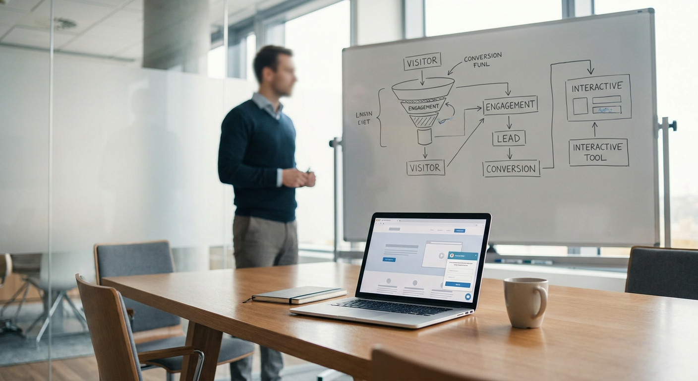
13. A/B Testing: The Only Way to Know What Works.
"Gut feelings" and "best guesses" are for amateurs. True landing page optimization relies on data. A/B testing involves creating two versions of a page (e.g., two different headlines, CTAs, or images) and showing them to different segments of your audience to see which performs better. It’s iterative, scientific, and the bedrock of conversion rate optimization (CRO).
*
Test One Element at a Time: Isolate variables for clear results.
*
Run Tests Long Enough for Statistical Significance.
*
Implement Winning Variations.
14. Trust Signals Beyond Testimonials:
Think about what else builds confidence. Privacy policies, clear contact information, security badges (if applicable), and guarantees all play a role. If your contact page is difficult to find or looks like it was made in 1998, that erodes trust.
15. Post-Click Experience: The Journey Continues.
The conversion doesn't end with the click. What happens *after* someone fills out your form or makes a purchase? A thank you page that confirms their action, sets expectations, and perhaps offers a next step (like joining your email list or following you on social media) is crucial for nurturing the relationship.
Beyond the Basics: What About Local?
If you're a St. George business, driving local traffic is paramount. Your landing page needs to speak to your community. While overarching LPO principles apply, consider how your offer resonates with the people here. Are you highlighting local relevance? Does your messaging align with the needs of St. George residents and businesses? This is where understanding your audience deeply, coupled with smart strategies like
local SEO, becomes a powerful combo. A generic landing page won't cut it when you're trying to connect with your neighbors.
Ready to Stop "Meh"-ing and Start Converting?
Your landing page is a critical asset, not an afterthought. If yours isn't pulling its weight, it's time to stop making excuses and start making changes. Generic templates from platforms like Wix or Squarespace might be easy, but they're often the enemy of true optimization. You need a strategic approach, tailored to your business and your audience.
At FunnelDonkey, we don't do "meh." We build high-performing landing pages designed to capture attention, build trust, and drive conversions. We're brutally honest, relentlessly data-driven, and deeply committed to helping businesses in St. George and beyond thrive.
If you're tired of wasting marketing dollars on pages that don't deliver, it's time for a conversation. We’re the anti-generic agency, the brutally honest copywriters, the conversion optimization fanatics who can turn your landing pages from digital tumbleweeds into lead-generating powerhouses.
Let's stop the "meh." Let's talk about your success.
[Get a Free Consultation](/contact) and let's start optimizing.
Further Reading